Quick Summary
Design KPIs and UX Metrics. How to measure UX and impact of design, with useful UX metrics to track the outcome of your design work. Good design decisions are intentional. They aren’t guesses nor a matter of personal preference. They are deliberate and measurable. Over the last few years, I’ve started using design KPIs and UX metrics that inform design decisions and guide designers, engineers and PMs.
Here are some examples:
1. Top tasks success > 80% (for critical tasks)
2. Time to complete top tasks < 60s (for critical tasks)
3. Time to first success < 90s (for onboarding)
4. Time to candidates < 120s (nav + filtering in eCommerce)
5. Time to top candidate < 120s (for feature comparison)
6. Time to final price < 45s (for eCommerce)
7. Time to hit the limit of free tier < 7d (for upgrades)
8. Default settings correction rate < 10% (quality of defaults)
9. Dashboard customization rate > 80% (for personalization)
10. Presets/templates usage > 80% per user (to boost efficiency)
11. Filters used per session > 5 per user (quality of filtering)
12. Feature adoption rate > 80% (usage of a new feature per user)
13. Time to pricing quote < 2 weeks (for B2B systems)
14. Application processing time < 2 weeks (online banking)
15. Testimonials click-through rate > 75% (quality of testimonials)
16. Early drop-off rate < 10% (for product landing pages)
17. Content clarity score > 80% (from qualitative testing)
18. Relevance of top 100 search requests > 80% (for top 3 results)
19. Search query iterations < 3/query (to avoid dead-ends)
20. Service desk inquiries < 35/week (poor design -> more inquiries)
21. Service desk response time < 12h (speed of processing)
22. Form input accuracy ≈ 100% (input by users in forms)
23. Frequency of errors < 3/visit (mistaps, double clicks)
24. Error recovery speed < 10s (quality of error messages)
25. Password recovery frequency < 5% per user (for auth)
26. Fake email addresses < 5% (for newsletters)
27. Video engagement rate > 40% of video (for video content)
28. Customers follow-up rate < 4% (quality of service desk replies)
29. “Turn-around” score < 1 week (frustrated users -> happy users)
30. Acquisition costs < $15K/week (poor design -> high acquisition costs)
31. Monthly recommendations rate > 5% per user (for referrals)
32. Design System Health > 80% (DS components in recent designs)
33. Environmental impact < 0.3g/page request (sustainability)
34. Flesch reading ease score > 60 (readability)
35. Rage and tap clicks rate ≈ 0% (for touch and mouse)
36. User frustration score < 10% (AUS + SUS/SUPR-Q + Lighthouse)
37. System Usability Scale > 75 (overall usability)
38. WCAG AA coverage ≈ 100% (accessibility)
39. Accessible Usability Scale (AUS) > 75 (accessibility)
40. Core Web Vitals ≈ 100% (performance)
These KPIs aren’t chosen randomly. They are shaped together by designers, engineers, stakeholders and users, and they must be guided by user needs and aligned with business goals. I can’t emphasize that last part enough: design shouldn’t be seen as a standalone activity as it impacts all parts of business.
For a given project and a given design team, 3–4 KPIs will be most critical. If we work on search, then we can track the quality of search over time. If we work on filters, we track how many filters are used per session, and how effective they are. As we move to a new project, we track a new set of KPIs.
This requires engineering to implement mechanisms to track adoption rates, but as a designer, we need to integrate tests of our design work in qualitative testing. And: personally, I try to stay away from surveys as they are incredibly difficult to get right, and always prefer insights from usability testing instead.
Useful resources:
The Ultimate Guide: Product Metrics 101 + PDF, by Paweł Huryn
UX Metrics, by Roma Videnov
Business Design Guide, by Alen Faljic
The Need To Think And Talk Like An Executive, Jared Spool
Design KPIs and UX Metrics, by Vitaly Friedman
Business Thinking For Designers, by Ryan Rumsey
Articulating Design Decisions (print + eBook), by Tom Greever
In Detail
Many organizations focus primarily on data coming from their analytics. This usually includes beautiful dashboards with data points and graphs on bounce rates, exit rates, time spent on site, navigation funnels and most used features or pages. Design KPIs are driven by numbers that don’t have any context and relate to an “average user” that doesn’t really exist.
That’s a very traditional approach that has its roots in an assumption that the more users stay on the site, the more satisfied they are with the experience on the site. As it turns out, often the opposite is true.
Don’t get me wrong: analytics is useful to identify trends and changes in user behavior, but it alone doesn’t provide us with insights on what exactly users are actually doing on the site. For example, some tasks might require a lot of reading and a lot of user’s input to be completed, but for others just a brief scan of a page might be perfectly sufficient to get a big picture.
Some users might find an answer to their question already in a rich snippet provided by a search engine. And on some pages, the content might be organized so well that there is absolutely no need to linger on the site longer than a few seconds.
With a better design, fewer people get lost, and more people find what they need. So it shouldn’t be surprising that as website owners, we might end up with reduced traffic and increased bounce rates. Usually this would be quite a warning sign, but it shouldn’t be — as long as we increase user satisfaction and reduce task completion times.
In my work, we tend to define design KPIs by focusing on two fundamental metrics:
how many people find what they are looking for,
how much time they need to find what they are looking for.
In detail, these attributes could be measured and tracked across a variety of user’s touch points:
top tasks completion rates for internal and external users,
top tasks completion times on or off the website,
overall satisfaction with the content and the experience on the site,
rate of errors and mistakes in navigation, search and data input (e.g. filters, forms, search queries),
accuracy of data successfully submitted by users (how difficult do we make it to make mistakes),
frequency of dead ends (404s, empty search/filtering results, lock-out rates in forms due to poor validation),
time to production, or how quickly users can publish quality content that matches all content and design requirements stipulated by our guidelines,
time to bugfixing, or how quickly teams can fix an issue surfaced in a production environment,
engagement rate, e.g. how effectively do we communicate messages to users or inform them about our campaigns (CTR rates, time to share).
web performance of the site, in terms of response times, Core Web Vitals, response to search/filtering queries, autocomplete etc.,
search-engine friendliness, e.g. average position in search results, the amount of rich snippets etc.

It’s worth noting that the definition of design KPIs should have a significant impact on how the quality of work done by content and engineering teams is measured. Rather than focusing on the amount of produced pages or websites, bounce rates or click rates alone, we should be aligned towards producing quality content that is useful for people consuming that content.
Measuring Design KPIs
Many companies publish content without consulting any design or content guidelines, with the end result often being pages that are difficult to find and to consume.
It’s absolutely critical to establish and measure organization-wide design KPIs that are measured, respected and considered by different teams involved in the production of digital content. Of course that also means establishing governance on how, by whom and how often data will be collected and evaluated.
During the development of the classification for navigation, we’ll be creating task instructions to validate that for the major top tasks, we can achieve 80–90% success rate. These task instructions should also serve as a foundation for design KPIs, but should be refined and extended over time.
We give the same task instructions to the same audience segments (both internal and external users) over time, preferably at least once every 6–12 months and measure success rates and completion times. The frequency of tests depends on the ability of the team to make changes. If we have a 40% failure rate for Task A and identify that M is causing it, we need time for the team to try and fix M before testing it. So, to some extent, the scheduling of the tests is dependent on the reaction time of the design/development team.
On a broader scale, if a particular group of tasks related to one specific department fails to achieve improvements in these metrics over time, there should be governance in place to prompt them on applying established content and production guidelines and improving these KPIs.
In detail, we need to specify:
content and production guidelines, design principles and best practices,
who exactly would be responsible for this task,
the tooling we would use to collect and analyze data,
how exactly the work done by content and engineering teams will be assessed by this data,
how and when the data will be deleted.
From the technical perspective, we need to track rate of errors and mistakes, accuracy of data and frequency of dead ends. This data could be surfaced through the server logs and data analytics tools.
For time to production and time to bugfixing, we need to track bottlenecks and slowdowns in teams, as well as explore tools, presets and templates that would speed up the workflows of teams to produce and deliver content.
For web performance, we need to audit and track the performance of our sites to see how well we are doing, especially on mobile, since a large portion of user base is accessing our websites on a mobile device.
For search-engine friendliness, we need to audit and track the performance in Google Search Console, and how it evolves over time.
For engagement rate, we need to identify the right timing and the right way to inform users about our campaigns and track click-through rates on calls to action.
Finally, we can learn about overall satisfaction with the content and the experience on the site by surveying users and gathering their feedback regularly, at least once every 3 months.
Ideally, all this data would be surfaced to the entire organization in a central dashboard or listing, e.g. such as the Performance service on Gov.uk, with the service manual being a driving force behind the way data is collected and evaluated.
Useful Design KPIs
accuracy of data
time to complete
time to relevance
error frequency
Top tasks completion rates
Top tasks completion times
error recovery speed (error messages)
performance (Core Web Vitals)
accessibility (axe)
occurrence of dead-ends (customer service)
speed of publishing (design system, templates)
time to release
time to share
time to upgrade
conversion rate
ecological impact
Useful Constraints
Quick jumps between views
Never lose user’s input
Maximize clarity, minimize errors
% of screen dedicated to content vs. navigation
supported languages
speed of publishing
technical limitations (legacy)
technical independence
governance
On Communication Metrics
While we know how to evaluate the performance of top tasks over time, dealing with our communication or engagement goals requires a different strategy. As it turns out in practice, users are much less likely to respond positively to any campaign or informational message when they are in the process of completing a task at hand. Any interruption is considered to be a distraction or annoyance, and as such, is often dismissed before a user even has a chance to understand what it is that is offered to them.
A critical task for improving communication metrics would be to find the right time and the right place to communicate our messages. It turns out that users are much more perceptive to respond positively after a successful task. That’s the best time to communicate, so we can design our campaigns around success moments, and connect them with the task the user has just completed.
These success moment could be on confirmation pages, finished transaction pages, or even logout pages. The strategy, then, is know exactly what people are trying to do, help them be successful in that task, and then show messages that relate to their particular case. This obviously requires more calibrated effort from the content and development team, but the results might be very impactful, and hence worth it.
Environmental KPIs
It’s worth noting that while the metrics listed above will help us make the overall experience more clear and accessible to users, it alone is only a part of the bigger picture. We’ll also need to focus on other aspects of the digital experience to make sure the renewed websites are seen as an example at the forefront of clean digital experiences of similar organizations. This goes very much hand in hand with the Sustainable Development Goals proclaimed by United Nations.
The new design will aim to be as environmentally-friendly and performant as possible. Reasonable environmental objectives that we could aim to achieve would be:
All pages will download in 3 seconds and a maximum of 6 seconds, on a typical mobile device in a representative selection of EU countries.
No page will weigh more than 1 MB, and ideally less than 500 KB.
Total CO2 emission from any page will be less than 0.50 grams per page download, and ideally less than 0.30 grams (GOV.UK, for example is .18 for homepage).
To reach these objectives, we’ll explore ways to reduce footprint, specifically:
exploring options for choosing a green web hosting provider with a high Power Usage Efficiency,
improving SEO and surface answers to common questions in search result descriptions,
simplification and clean-up of content currently published,
optimizing for clear, efficient and straightforward copywriting,
streamlining user experience to help people find answers quickly,
reduce the impact of images, videos and fonts,
reduce the impact of code processing for every page request,
caching files on user’s devices to avoid the amount of data loaded with every visit,
establish performance budgets and publishing restrictions for size and impact of content on a website, and introduce techniques to conditionally request assets if needed.
By establishing rules and guidelines around these attributes, we can dramatically reduce the environmental impact of our websites.
Design KPIs
Design isn’t art. It solves problems. So we should be able to measure how well a particular design solves a particular problem. That’s why I start working by setting Design KPIs, and tracking them over time. Here’s a list of some KPIs that I tend to use frequently:
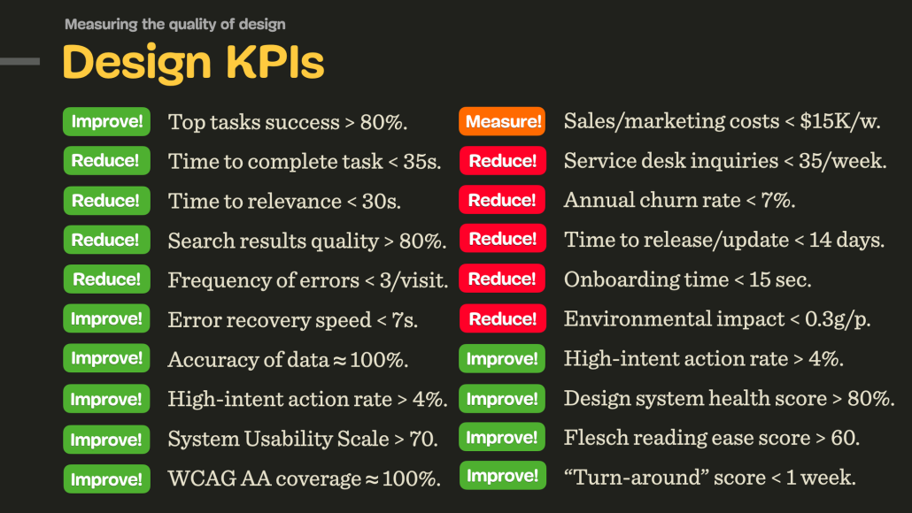
1. Top tasks success rate > 80% (for most important tasks).
2. Time to complete < 35s (for most important tasks).
3. Time to relevance < 30s (for navigation and search).
4. Search results relevance rate > 80% (for top 100 search queries).
5. Search query iterations < 3/query (to avoid dead-ends in search).
6. Average frequency of errors < 3/visit (mistaps, double clicks).
7. Error recovery speed < 7s (effectiveness of error messages).
8. Accuracy of data ≈ 100% (input provided by customers in forms).
9. High-intent action rate > 4% (the effectiveness of a campaign).
10. Sales and marketing costs < $15K/week (poor design -> increased marketing costs).
11. Revenue growth rate >5% (how design helps with business goals).
12. Retention rate > 90% (indicates price/quality ratio).
13. Annual churn rate < 7% (indicates price/quality ratio).
14. Onboarding time < 15 sec (how quickly users can get to a first success moment).
15. Service desk inquiries < 35/week (poor design -> more inquiries).
16. Service desk response time < 12h (speed of processing).
17. Customers follow-up rate < 4% (quality of service desk replies).
18. “Turn-around” score < 1 week (time needed to turn frustrated users -> happy users).
19. Design system health score > 80% (e.g. reusability of components).
20. Time to release/update < 14 days (speed of deployment and maintenance).
21. Environmental impact < 0.3g/page request (sustainability of the design).
22. Flesch reading ease score > 60 (quality of text/copywriting).
23. System Usability Scale > 75 (overall usability assessment tool).
24. WCAG AA coverage ≈ 100% (how accessible the product is).
25. Core Web Vitals ≈ 100% (how fast and performant the product is).
For a given project, around 3–4 KPIs will be most critical, and there will be around 4–5 further KPIs being measured over time — once every 4–6 months, along with user interviews designed to test how well and how fast users complete their tasks.
It’s worth noting that every team usually has their own tailored set of custom KPIs. The success of each team is then assessed by how well they are performing across their own KPIs.
Further Reading
ORKs for designers and design teams
Reimagining OKRs for design teams
Use OKRs to Set Goals for Teams, Not Individuals
UX Metrics: Qualitative Research
North Star Framework
![]() The North Star Framework (Miro board), a helpful framework, workshop and resource library to identify a single, crucial metric that captures the core value that your product delivers to your customers. Discovered via John Cutler.
The North Star Framework (Miro board), a helpful framework, workshop and resource library to identify a single, crucial metric that captures the core value that your product delivers to your customers. Discovered via John Cutler.
Useful resources
North Star Metrics Examples, by Paweł Huryn ![]()
North Star Playbook, by Amplitude
Getting Started: Running a North Star Workshop
North Star Metric Explained, by Itamar Gilad
UX Metrics That Matter: A Guide to Design KPIs
Good design is always guided by an objective and a purpose. I absolutely love the idea of having one, clear objective that guides and informs design decisions, which is also deeply connecting business goals, design KPIs and design impact.
Kudos to the entire Amplitude team for sharing the incredible resources with everyone to use!
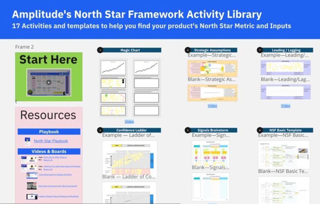
The North Star Framework (Miro board)
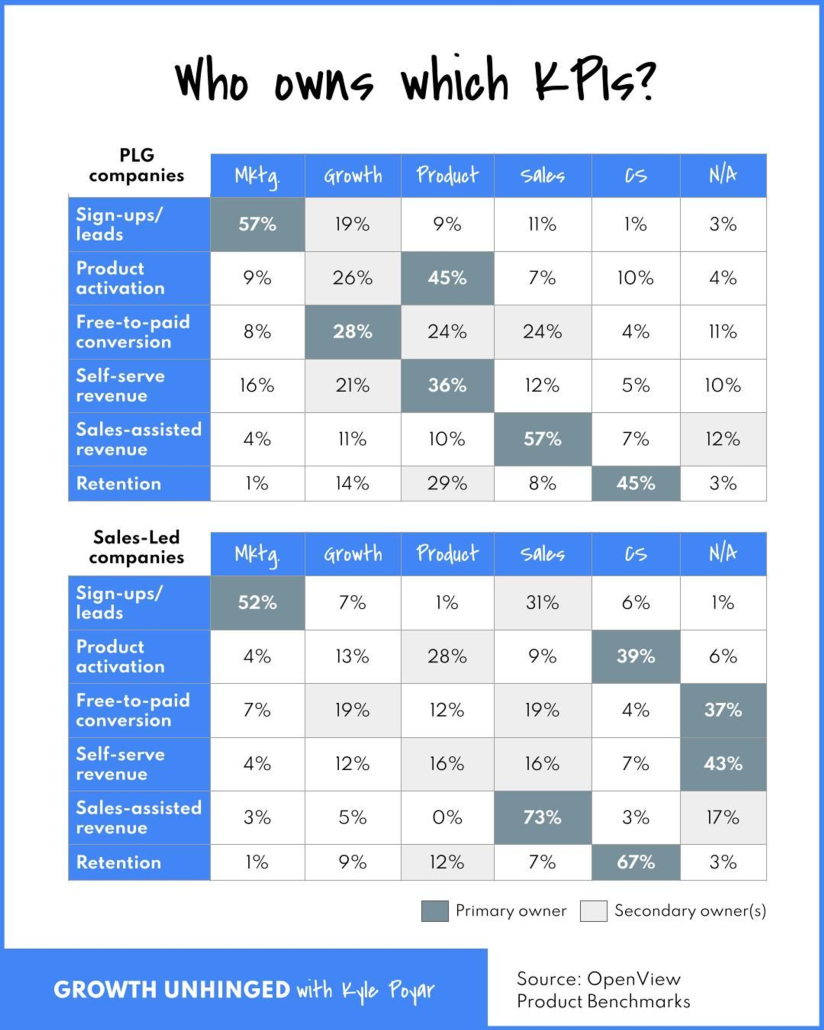
Who Owns Which KPIs?
MARKETING
Owns new sign-ups/leads (>50% of the time)
May own self-serve revenue at PLG companies (16% of the time)
GROWTH
Has the broadest mandate, but is rarely the primary owner of any single KPI (with the possible exception of free-to-paid conversion)
Influences across the funnel including new sign-ups/leads, product activation, and self-serve revenue
Doesn’t have a clear swim lane at non-PLG companies
PRODUCT
Owns product activation (45% of the time) and self-serve revenue (36% of the time) at PLG companies
Doesn’t tend to have clear growth KPI ownership at sales-led companies (missed opportunity?)
SALES
Owns sales-assisted revenue (>50% of the time)
Highly influential across other KPIs at sales-led companies
CUSTOMER EXPERIENCE
Owns retention, especially at sales-led companies (67% of the time)
Likely to own onboarding & activation at sales-led companies (39% of the time) with an assist from product
Data source: 2023 Product Benchmarks
Product-Led Growth (PLG) Companies:
Product-Led Growth is a modern business approach that emphasizes the value of the product itself as the primary driver of customer acquisition, conversion, and retention. In PLG companies, the product is designed to be intuitive, easy to use, and self-explanatory, allowing users to experience its value without the need for extensive sales interactions.
Key characteristics of PLG companies include:
Self-Service Onboarding: The product is designed for self-service onboarding, enabling users to sign up, use, and explore its features without the need for a salesperson.
Free or Freemium Model: Many PLG companies offer a free version or freemium model of their product, allowing users to access basic features for free and then upgrade to premium features as needed.
Virality and Word-of-Mouth: PLG products are often designed to encourage sharing and collaboration, which can lead to organic growth through word-of-mouth and viral adoption.
Data-Driven Iteration: PLG companies rely heavily on data to analyze user behavior, understand feature adoption, and make continuous improvements to the product.
Minimal Sales Involvement: While PLG companies may have a sales team to handle enterprise-level deals or upsells, the focus is on enabling users to discover, adopt, and upgrade within the product itself.
Sales-Led Companies:
Sales-led companies follow a more traditional approach to customer acquisition, where the sales team plays a central role in driving revenue. These companies typically have a larger sales team and prioritize sales interactions and relationships to close deals.
Key characteristics of sales-led companies include:
- High-Touch Sales Process: Sales-led companies have a more personalized and high-touch sales process, often involving multiple interactions between sales representatives and potential customers.
- Customized Solutions: Sales teams in these companies focus on understanding customer needs and tailoring solutions to match those needs, which can involve customization or integration of the product.
- Longer Sales Cycles: The sales-led approach often leads to longer sales cycles due to the need for extensive customer education, negotiations, and approvals.
- Enterprise Sales Focus: Sales-led companies often target larger enterprise-level customers that require complex solutions and may involve multiple stakeholders.
- Upselling and Cross-Selling: While PLG companies can also engage in upselling and cross-selling, sales-led companies place more emphasis on these activities to maximize revenue from existing customers.
It’s important to note that the distinction between PLG and sales-led companies is not always black and white. Many companies adopt a hybrid approach, combining elements of both strategies based on their target market, product complexity, and growth goals. Additionally, the effectiveness of each approach can vary depending on the industry, product type, and customer preferences.
The Easiest Way to Update Your Documents
(1) Go to Media (by clicking Media on the menu) and then (2) search for the name
Temp Pages and Permalinks
Utilizing the drafts feature should prevent any need for creating place holder p
Tools for Getting your Message Out
There is a lot of conflicting information making the rounds on what can and can&
Validation Checklist
Validating a website is the process of ensuring that the pages on the website co
Replacing Files
Our wordpress installations come with many custom features, one of which include
CAPS and Underlines
ON THE INTERNET, ALL CAPS IS CONSIDERED “YELLING”.
Social Media Image Size Cheat Sheet
Social media image size cheat sheet Throughout this post, you’ll find the size a
How to Link to a PDF from a Post or Page
Go to Media…..add new Click Select Files and navigate to the PDF file or d
Limit PDF Usage
PDFs have allowed people to collaborate and share ideas across devices since 199
Social Media Statistics
Fun Facts: Your tweets have a 12x higher chance of being retweeted if you ask fo
How to set a PDF form to SAVE the Information that Someone Enters
The tricky tricky thing that gives people the most trouble by far with Acrobat h
Social Media Overview
First Things First Know your visitor. The obvious choice of social network is th
X Image Sizes
Social media platforms are constantly evolving their algorithms and interfaces.
Turn off X Autoposting to Facebook
If you use a Twitter account and a Facebook page, you can connect Twitter to the
Using Hashtags
By cleverly targeting certain hashtags you’ll be more likely to start conversati
Getting Started with X
Your school likely already has a twitter account. Please do not register multipl
Embedding PDF Files
Click to View Examples of the Different Layouts Full Window <div id="a
Social Media Checklist – Facebook
Make sure your facebook page is in tip-top shape for the coming school year!
Calendar Layouts
Calendar View Examples for displaying calendar Calendar Demo ADVANCED Shortcodes
Getting Started – Important
The first step is to get access to your school’s page. ALL SCHOOL FACEBOOK
Turn off Facebook Autoposting to Twitter
Turn off automatic Twitter posting by unlinking the two accounts. You can also r

