Inclusive Design Toolkits and Templates
Stark Accessibility Library https://www.getstark.co/library/all/
https://cms.ku.edu/web-writing-checklist
Inclusive Design Toolkit, by Microsoft https://inclusive.microsoft.design/
Screen Reader Accessibility Support https://a11ysupport.io/
WhoCanUse Accessibility Testing Repository https://www.whocanuse.com/
Inclusive Design Toolkit, by University of Cambridge https://www.inclusivedesigntoolkit.com/
Inclusive Mindset Figma Workbook https://www.figma.com/community/file/1105798401848507376/inclusive-mindset-workbook-by-project-lima
Inclusive Thinking Audit Template https://www.figma.com/community/file/1019572651067229305/inclusive-thinking-audit-template
Inclusive Persona and Compassion Map, by Katie Miller https://www.figma.com/community/file/1174001983106155637/inclusive-persona-and-compassion-map
Diversity & Inclusion Workshop Miro Kit https://miro.com/templates/diversity-and-inclusion-workshop-the-multiverse-toolkit/
Inclusive Design Figma Toolkit, by Sara Stevanovic https://www.figma.com/community/file/1110408591856289935/inclusive-design-toolkit
The Micropedia of Microagressions https://www.themicropedia.org
The Gender-Inclusive Language Project, kindly shared by Kinneret Yifrah. https://uxcontent.com/gender-inclusive-language-project
Inclusive Design Illustrations, by Maxime Rabot https://www.figma.com/community/file/946569165254852480/inclusive-design-illustrations
Inclusive Design Principles https://www.figma.com/community/file/1019964829547102509/inclusive-design-principles
A Beginner’s Guide To Inclusive UX Design, by Trina Moore Pervall https://uxdesign.cc/a-beginners-guide-to-inclusive-ux-design-b8dcc94f5068
A Designer’s Guide to Documenting Accessibility & User Interactions by Stéphanie Walter https://stephaniewalter.design/blog/a-designers-guide-to-documenting-accessibility-user-interactions/
Building Accessible and Inclusive Animations by Stéphanie Walter https://stephaniewalter.design/blog/enhancing-user-experience-with-css-animations/
Autism
 How To Design For Autistic People. Nearly 1% of the global population is autistic. Here’s what we need to know to design better UX
✅ Autism is a different way of experiencing the world.
✅ The experience is usually intense and tangled.
✅ 40% of autistic people have an anxiety disorder.
✅ Have a low tolerance to uncertainty and lack of control.
✅ Strongly sensitive to bright colors and high contrast.
✅ Very literal, so it’s hard to infer meaning that’s not obvious.
✅ Autistic children grow up into autistic adults.
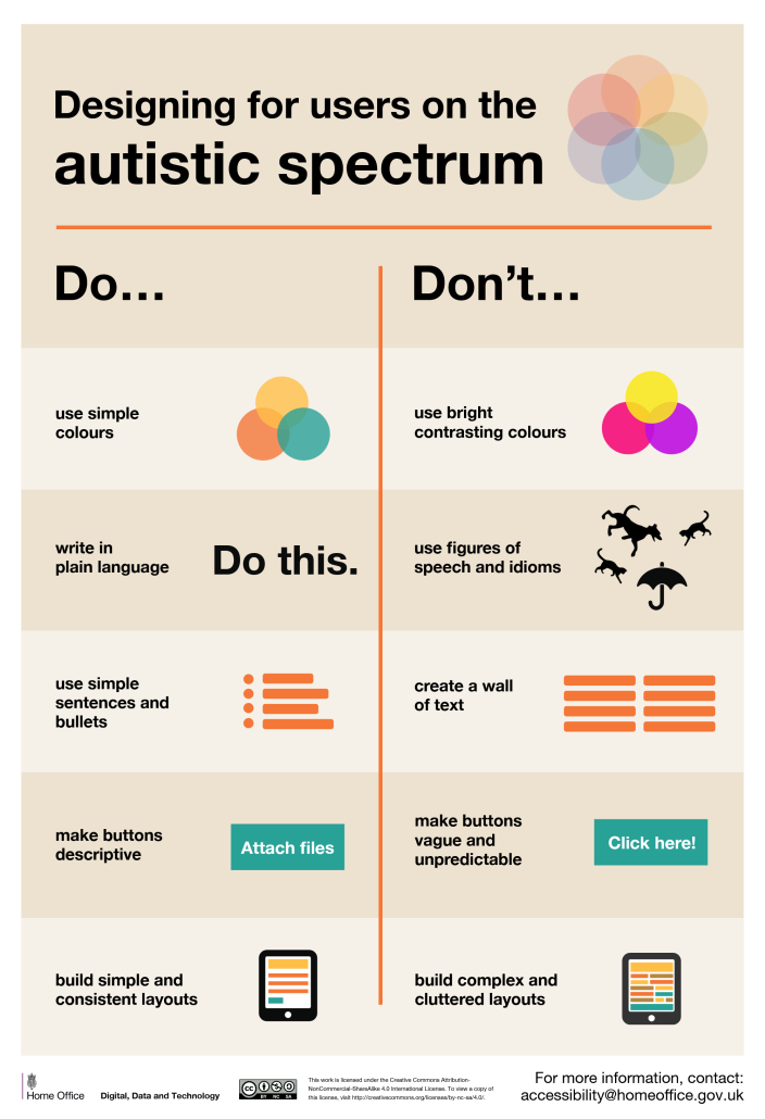
🚫 Avoid bright contrasting colors and high luminance.
🚫 Avoid figures of speech and idioms (verbal or visual).
🚫 Avoid animations that are hard to control (blinking ads).
🚫 Avoid non-conventional scrolling behaviour (e.g. parallax).
🚫 Avoid time countdowns, time outs and a sense of urgency.
🚫 Don’t rely on jargon, abbreviations, sarcasm, idioms or sayings.
✅ Show all content about a subject on a single page.
✅ Use soft, muted colors and avoid pure white or black.
✅ Add text labels to icons and avoid icons-only buttons.
✅ Allow users to save and return to forms later.
✅ Respect user’s reduced motion preferences.
✅ Support email/chat as communication options.
✅ Autistic children tend to be visual learners.
✅ Autistic adults prefer well-structured text.
There is no single, shared “autistic experience” — every person on the autism spectrum experiences the world differently. Oftentimes with their own superpowers in fast learning or keen attention to details, and sometimes with enormous frustration about the busy and noisy world around us. We can rarely design one single perfect experience for absolutely everyone. But by involving diverse users in usability testing, we can make our products more accessible. That might be a few hours of work for us, but it might be life-changing for other people — and that’s worth it.
Design For Autistic People, by Irina Rusakova https://accessibility.blog.gov.uk/2016/09/02/dos-and-donts-on-designing-for-accessibility/
Designing For Users On The Autistic Spectrum (PDF) https://accessibility.blog.gov.uk/2016/09/02/dos-and-donts-on-designing-for-accessibility/
Usability Testing with Autistic People, by Varnagy-Toth Zsombor https://www.uxmatters.com/mt/archives/2015/10/usability-testing-with-people-on-the-autism-spectrum-what-to-expect.php
The Pattern Seekers (Book), by Simon Baron-Cohen https://www.penguin.co.uk/books/289738/the-pattern-seekers-by-baron-cohen-simon/9780141982397
Colorblindness
💎 How To Design For Colorblind People. 300 million people have some kind of colorweakness or are colorblind. Here’s what we need to know to make better color choices
✅ Red-/green deficiencies are more common in men than women.
✅ Blue is the safest hue if you want users to perceive color as you do.
✅ Use any 2 colors you like as long as they vary by lightness.
✅ Colorbrlind users can tell red/green apart, but can’t see which is which.
✅ The colorblind-safest color palette is to mix blue with orange or red.
🚫 Don’t mix red, green and brown together.
🚫 Don’t mix pink, turquoise and grey together.
🚫 Don’t mix purple and blue together.
🚫 Don’t use green and pink if you use red and blue.
🚫 Don’t mix green with orange, red or blue of the same lightness.
These insights come from “How Your Colorblind And Colorweak Readers See Your Colors” (https://www.datawrapper.de/blog/colorblindness-part1), a wonderful three-part series on how colorblind and colorweak readers perceive colors, things to consider when visualizing data and what it’s like to be colorblind. It’s worth noting that the safest bet is to never rely on colors alone to communicate data. Use labels, icons, shapes, rectangles, triangles, stars to indicate differences and show relationships. Be careful when combining hues and patterns: the pattern changes how bright or dark colors will be perceived. Use lightness to build gradients, not just hue. Using different lightnesses in your gradients and color palettes so readers with a color vision deficiency will still be able to distinguish your colors. And most importantly, always include colorweak and colorblind people in usability testing.
Further reading:
Who Can Use This Color Combination?, by Corey Ginnivan https://www.whocanuse.com/
Colorblind-Friendly Design Guidelines, by Unma Desai https://uxdesign.cc/the-importance-of-colorblind-friendly-design-case-study-among-us-dcd042c87b9
Color Blindness Simulator Figma Plugin, by Sam Mason de Caires https://www.figma.com/community/plugin/733343906244951586/color-blind
Colorblindly Chrome Extension, by Tom van Beveren https://chromewebstore.google.com/detail/colorblindly/floniaahmccleoclneebhhmnjgdfijgg
Improving The UX For Color-Blind Users, by Adam Silver https://www.smashingmagazine.com/2016/06/improving-ux-for-color-blind-users/
 Color contrast
https://smart-interface-design-patterns.com/articles/color-contrast-cheat-sheet/
🚫 Poor color contrast is the most common problem on the web.
✅ Contrast captures the difference in brightness between colors.
✅ Technically, it’s calculated using relative luminance of colors.
✅ The greater the difference in luminance, the higher the contrast ratio.
✅ The higher the contrast ratio, the better the readability.
✅ White-on-white has 1:1 contrast ratio (min), black-on-white is 21:1 (max).
✅ Moderate contrast between these extremes usually works best.
✅ We use it to ensure legibility and color differentiation in our UIs.
High color contrast alone isn’t sufficient for colorblind people.
WCAG 2.1 Level AA (industry standard), minimum:
✅ 4.5:1 for regular text (7.1 for AAA)
3:1 for text larger than 24 pixels (4.5:1 for AAA)
✅ 3:1 for bold text larger than 18pt (19 pixels) (4.5:1 for AAA)
✅ 3:1 icons and graphs of any size
3:1 UI elements, buttons, borders, underlines
These guidelines are minimum recommendations, and color contrast is one of the many factors that contribute to better accessibility. We might want to add a border to create boundaries for our UI components. And it is a good idea to add an icon or an underline to clearly mark interactive components.
Useful tools:
Colorable: https://colorable.jxnblk.com/
Closest Accessible Colors: https://www.learnui.design/tools/accessible-color-generator.html
Brand Colors Generator: https://abc.useallfive.com/?colors[]=006CB7,00AEEF,F99D1C,FFDA00
A11y Color Contrast in Figma: https://www.figma.com/community/plugin/733159460536249875/a11y-color-contrast-checker
Leonardo: https://leonardocolor.io
Color Blind Figma Plugin: https://www.figma.com/community/plugin/733343906244951586/color-blind
Useful articles:
An Interactive Guide To Colors and Contrast, by Nate Baldwin https://colorandcontrast.com
The “Dark Yellow Problem” in Color Palettes https://uxdesign.cc/the-dark-yellow-problem-in-design-system-color-palettes-a0db1eedc99d
Accessible Palette: Stop Using HSL for Color Systems, by Eugene Fedorenko https://www.wildbit.com/blog/accessible-palette-stop-using-hsl-for-color-systems
✂️ Accessible Numbers: How To Design With Numbers.
Approx. 3–10% of people have dyscalculia, but many are unaware of that. Guidelines to help everyone better understand numbers, measurements, dates and times ↓
✅ Dyscalculia is a persistent, life-long difficulty in understanding numbers.
✅ It makes it hard to read and spot patterns in numbers.
✅ It can be hard to tell apart numbers/letters, e.g. 7/L or 0/O.
✅ Most people are unaware of dyscalculia, but struggle with numbers.
✅ Frequent issues with phone numbers, birthdays, time tables, charts.
🚫 Don’t use decimals unless you must (money, dosage etc).
🚫 Don’t expect users to repeat or remember numbers.
🚫 Don’t rush users to enter a number accurately.
🚫 Don’t make entering a number the only option for verification.
🚫 Don’t time people out and don’t lock them out for 24h.
✅ Round values up to the nearest whole number unless it’s money.
✅ 5pm (not 5.00pm), midnight (not 12am), 6 hours 30 minutes (not 6.5hrs).
✅ “One or two 200mg tablets”, not “1 or 2 200mg tablets”.
✅ Leave space around numbers, so they don’t jump around so much.
✅ Allow people to include spaces when entering numbers.
✅ Allow people to copy/paste into forms in the format they prefer.
It might feel like a broken record, but the best way to improve design is to test with a wide range of people as a part of the design process. Whenever possible, involve people who struggle with numbers in the design process. Not only will it make it easier for them to deal with numbers — it will also help people with low numeracy and everyone make fewer mistakes and make sense of the content faster.
Useful resources:
Numbers, Measurements, Dates and Time Guidelines, by NHS https://service-manual.nhs.uk/content/numbers-measurements-dates-time
What is Dyscalculia? (+ video), by Daniel Ansari https://www.understood.org/en/articles/what-is-dyscalculia
Dyscalculia and Trouble with Time, by Christen Barbercheck https://www.timetimer.com/blogs/news/dyscalculia-and-trouble-with-time
Designing for People With Dyscalculia and Low Numeracy (+ PDF poster), by Jane McFadyen https://designnotes.blog.gov.uk/2022/11/28/designing-for-people-with-dyscalculia-and-low-numeracy/
 Dyslexia
💎 How To Design For Users With Dyslexia.
Almost 10% of all of us have some sort of dyslexia, but too often it’s not a part of design conversations. Let’s change that ↓
– For dyslexic users, reading can take up to 3× as long.
– Users often confuse and swap b, p, d and n, u and m, w.
– Remembering words between screens is difficult.
– Heavily distracted by flashing images or sounds.
– Difficulty to read analog clocks, time, directions, numbers.
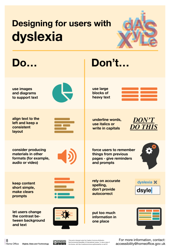
✅ Avoid dynamic, moving or flashing images.
✅ Avoid heavy underlines, uppercase and italics.
✅ Don’t rely on accurate spelling; use autocomplete.
✅ Always align text to the left and avoid text justification.
✅ Avoid lengthy columns for reading (45–65 chars per line).
✅ Consider text-to-speech, Bionic reading and dark mode.
✅ Simple sans-serif fonts with generous spacing perform best.
✅ Use dark grey instead of black, and soft colors instead of white.
Useful resources:
Design Guide For Dyslexia https://uxcel.com/lessons/designing-for-dyslexia-081
Designing With Dyslexia, by Alex Morris https://uxplanet.org/designing-for-dyslexia-6d12e8c41cd7
Software Accessibility for Users with Dyslexia https://uxdesign.cc/software-accessibility-for-users-with-dyslexia-a506698af4d6
Design For Dyslexic Users, by Pradipto Chakrabarty https://uxplanet.org/ui-design-for-dyslexic-users-7a17233f5db7
What Makes a Typeface Accessible, by Gareth Ford Williams https://medium.com/the-readability-group/a-guide-to-understanding-what-makes-a-typeface-accessible-and-how-to-make-informed-decisions-9e5c0b9040a0
How to Involve Dyslexic Users Into Your Design https://uxdesign.cc/accessibility-how-to-involve-dyslexic-users-into-your-design-aab031ee588d
How to Write With a Dyslexic Audience in Mind, by Trisha Dunbar https://writingcooperative.com/how-to-write-with-a-dyslexic-audience-in-mind-6c69814f417d
Dos and Donts on Designing for Accessibility https://accessibility.blog.gov.uk/2016/09/02/dos-and-donts-on-designing-for-accessibility/
Legibility
🚫 Avoid centered text if you can, at least for more than 3 lines of text.
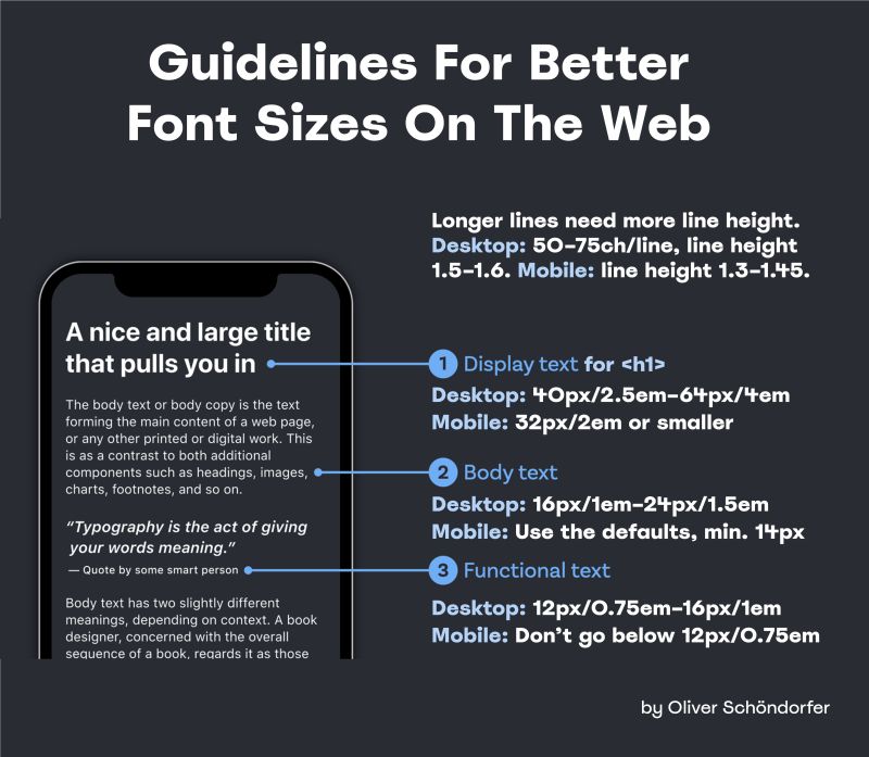
✅ Font size, line height and line length are always connected.
✅ Longer lines need more line height, shorter lines need less.
✅ Use a type scale to choose a typographic hierarchy.
✅ Ideally, make the line height fluid and locked to the column width.
✅ If you have to use one line-height value for desktop/mobile, use 1.5.
Display text (for <h1>)
✅ Default choice: 40px/2.5em for an <h1>.
✅ Desktop: go up until 64px/4em (max).
✅ Mobile: 32px/2em or smaller, since it uses up too much space.
✅ Larger headings work better with smaller line height — e.g. 1.1.
✅ Line height smaller than the type size might work better.
Body text
✅ Default choice: 16px/1em (also browser’s default).
✅ Desktop: go up until 24px/1.5em (max).
✅ Mobile: Use the defaults, at times 10% smaller (min 14–15px)
✅ Desktop: keep 50–75 chars per line (25–37.5rem), line height 1.5–1.6.
✅ Mobile: usually 40–50 chars per line (20–25rem), line height 1.3–1.45.
Functional text (captions, nav)
✅ Default choice: 12px/0.75em – 14px/0.875em.
✅ Desktop: go up until 16px/1em.
✅ Mobile: Don’t go below the defaults, it’s already very small. The attributes of a typeface define how font size, line length and line height work together. Typically we would first choose the right typeface(s) and set a type scale for headings, body text and functional text. Then, we achieve fluid typography with CSS clamp(), where we interpolate between min/max values for font size and line height, depending on container’s width (and hence line length). There is no magic number that will always look right, but the guidelines above and the tools below hopefully will move the needle in the right direction. And when in doubt, make your font size larger.
 Useful resources:
Line Length Revisited: https://designregression.com/article/line-length-revisited-following-the-research
Practical Typography (free book), by Matthew Butterick https://practicaltypography.com/
Modern Fluid Typography with CSS, by Adrian Bece https://www.smashingmagazine.com/2022/01/modern-fluid-typography-css-clamp/
Useful tools:
Fluid Type Editor: https://modern-fluid-typography.vercel.app/
Proportio: https://proportio.app
Utopia: https://utopia.fyi/type/calculator/
Fluid Type Scale: https://www.fluid-type-scale.com/
Type Scales (Figma, Adobe XD): https://typescale.io
Mental Health
💝 Designing For Mental Health, with key takeaways, practical guides, design patterns and resources to design mental health products that work for people
✅ People should make informed choices about the support they receive.
✅ People need clarity on the process and boundaries of delivery.
✅ Services must quickly adapt in response to changing situations.
✅ People should feel trust in safely engaging and expressing themselves.
✅ People highly value face-to-face emotional support. Key design patterns:
✅ Provide routes to anonymity and ways out.
✅ Fear of failure blocks people; help them overcome it.
✅ Only ask the user to tell you their story once.
✅ Always provide a range of channels to communicate.
✅ Manage expectations and display hours of service.
✅ Be clear as to where your support begins and ends.
✅ Provide users with a way to quickly exit/hide visible content.
✅ Tell people how you will use their information.
✅ Enable access to help from a real person if possible.
Talking about mental health can be awkward and embarrassing, but it really shouldn’t be. We need to talk about mental health more openly, encourage self-care and design resources and products that support people seeking for help. And as they do, we need to show respect, understanding and unconditional support. No one can do everything. Everybody struggles. Everybody feels like an impostor. But there are thousands of wonderful people willing to help day and night. Encourage self-care and self-respect. Nobody should feel alone.
Useful resources:
Design Patterns for Mental Health https://designpatternsformentalhealth.org
Plain Language Guidelines https://digital.gov/guides/plain-language
Inclusive Language: Words to Use and Avoid https://www.gov.uk/government/publications/inclusive-communication/inclusive-language-words-to-use-and-avoid-when-writing-about-disability
Designing Interfaces For Mental Health, by Grace Yang https://medium.com/design-bootcamp/designing-interfaces-for-mental-health-42d3963fe8bc
Designing for Mental Health, by Nevilson Christian https://www.uxmatters.com/mt/archives/2023/06/designing-for-mental-health-creating-user-experiences-that-support-well-being.php
The Self-Care Playbook for UX Researchers (and Designers), by Lizzy Burnam https://www.userinterviews.com/blog/self-care-for-ux-researchers
Older Adults
One billion people aged 60+ live today, and it’s growing faster than any other age group. Key points to consider to make your designs more inclusive for older adults ↓ 🚫 Don’t assume that older adults struggle to use digital.
🚫 You don’t need to strip the design to bare minimum.
🚫 Avoid stereotypes and assumptions about elderly.
✅ Most users are healthy, active and have a solid income.
✅ Older adults often read and analyze every word (Stroop effect).
✅ Shades of blue/purple and yellow/green are difficult to distinguish.
✅ Visuals with a similar contrast are harder to tell apart.
✅ Often struggle with text input and precise movements.
✅ Users are more likely to perform actions they didn’t mean to.
✅ They take more time and need more control over the process.
✅ They often view error messages as a personal failure.
🚫 Avoid disappearing messages: let users close them.
🚫 Avoid accessibility overlays; they are often inaccessible.
🚫 Avoid long, fine drag gestures and precision.
🚫 Avoid floating labels and use static field labels.
🚫 Don’t rely on icons alone: add descriptive labels.
✅ Ask for explicit confirmation for destructive actions.
✅ Add a “Back” link in addition to browser’s “Back” button.
✅ In forms, present one question or one topic per screen.
Useful resources
A Guide to Interface Design For Older Adults, by Sergei P. https://www.toptal.com/designers/ui/ui-design-for-older-adults
Designing Age-Inclusive Products, by Michal Halperin Ben Zvi (PhD.) https://www.smashingmagazine.com/2023/07/designing-age-inclusive-products-guidelines-best-practices/
Designing User Interfaces for an Aging Population, by Jeff Johnson and Kate Finn https://www.uxmatters.com/mt/archives/2017/04/designing-user-interfaces-for-an-aging-population.php
Usability Testing With Older Adults, by Megan Chan https://www.nngroup.com/articles/usability-testing-older-adults/
Screen readers
How Screen Readers Work, And How Users Use Them. With behavior patterns, practical insights and things to keep in mind for accessibility.
✅ 253 million people worldwide have a visual impairment.
✅ Screen readers help them translate text to speech or Braille.
✅ They work for websites, PDFs, emails, OS and other documents.
✅ They use the same voice regardless of font size, weight, color.
✅ E.g. Jaws/NVDA (Win, 80% share), VoiceOver (iOS), Talkback (Android).
🤔 Users often listen to screen readers at the 1.5–2.0x speed.
✅ Repetitive labels and hints aren’t helpful (image caption, alt).
✅ Content order during tabbing conveys the structure of the page.
✅ Follow a logical linear layout, don’t spread content all over a page.
🚫 Auto-playing audio is often an alarming, frustrating experience.
🤔 Users heavily rely on descriptive headings and labels.
🚫 Screen readers can‘t extract semantics from non-semantic HTML.
🚫 Screen readers can’t extract meaning from images or videos.
✅ Good HTML is everything: use links for links, buttons for buttons.
✅ Avoid “Click here”, “Read more”, “View now” for links.
✅ A text box without a label is meaningless to screen readers.
✅ Never rely on visuals alone, they might not even be there.
🤔 Users mostly navigate with keyboard or touch gestures on mobile.
🤔 Frequent issues with poorly structured forms, navigation, PDFs.
✅ Add UI controls for mouse-precise actions (drag’n’drop, resizing).
✅ Ensure PDF/UA compliance to generate accessible PDFs.
✅ Include nav landmarks, so users can jump within the page quickly.
✅ Always add labels to forms and avoid CAPTCHAs if you can.
Where “abled people” use their natural feelings such as sight and hearing, people with disabilities must rely on technologies. Screen reading UX shouldn’t mean a “simplified” experience. It’s just a different experience, one of many. Unfamiliar tools might sound scary. Just start. Get familiar with screen readers. Run accessibility testing with a few screen reader users. Eventually make screen reader testing a part of QA. Many accessibility issues are severe, but solutions can be simple — and impactful for people who need them most.
Useful resources:
How A Screen Reader User Surfs The Web (video), by Léonie Watson https://www.youtube.com/watch?v=OUDV1gqs9GA
Testing With Blind Users: A Cheat Sheet, by Slava Shestopalov https://www.smashingmagazine.com/2023/06/testing-sites-apps-blind-users-cheat-sheet/
Accessibility and Inclusivity: Study Guide, by Tanner Kohler, NN/g https://www.nngroup.com/articles/accessibility-inclusivity-study-guide/
How To Document Screen Reader UX (+ Poster), by BBC https://bbc.github.io/accessibility-news-and-you/guides/screen-reader-ux.html
Setting Up A Screen Reader Testing, by Sara Soueidan https://www.sarasoueidan.com/blog/testing-environment-setup/
Target sizes
- Mobile Accessibility Target Sizes Cheatsheet
- Accessible Target Sizes, by Amy Lupe
- Touch Targets on Touchscreens, by Aurora Hailey
- Enhancing the Clickable Area, by Ahmad Shadeed
- WCAG 2.55 for Better Target Sizes, by Todd Libby
- Fitt’s Law In The Touch Era, by Steven Hoober
- Touch Design For Mobile Interfaces, by Steven Hoober
- Type Sizes for Every Device, by Steven Hoober